

Why Color Coordination Feels Hard (And Why It Isn't)
Most people who think they're bad at color coordination aren't actually bad at it — they just haven't been shown the underlying logic. Fashion media tends to make it look like an instinct you either have or you don't. In reality, color coordination follows a small set of patterns that repeat across virtually every outfit that works.
The good news: you don't need to memorize anything complicated. Once you understand two or three basic relationships, you'll start recognizing them everywhere — in store displays, in outfits you already own, and in combinations that have always felt "off" without knowing why. If you're also starting to build your wardrobe from the ground up, see our guide for building a wardrobe from scratch for a practical foundation.
The Color Wheel Is a Tool, Not a Law
Color wheels and coordination frameworks are guides, not rulebooks. Fashion has always made room for intentional rule-breaking — worn-in color combos that technically 'shouldn't' work often do because of how they're styled or worn with confidence. Use these principles as a starting point, not a ceiling.
The Four Color Relationships Worth Knowing
You don't need the whole color wheel — just these four approaches cover the vast majority of everyday outfit decisions:
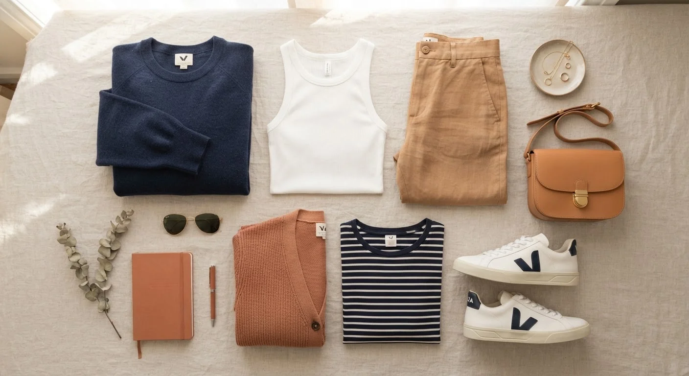
- Neutral pairing: Neutrals (white, black, gray, navy, camel, beige) work with virtually any other color. An outfit built on neutrals almost always reads as put-together.
- Monochromatic: Different shades, tints, or tones of a single color family — like light blue, medium blue, and denim — worn together. Effortlessly cohesive and surprisingly easy to execute.
- Complementary contrast: Colors directly opposite on the color wheel, such as blue and orange or purple and yellow, create high contrast that feels bold and balanced. Even small doses work — a rust-colored bag with a navy outfit, for example.
- Analogous harmony: Colors that sit next to each other on the color wheel (like green, teal, and blue) feel naturally harmonious. This is the approach behind most earthy or jewel-toned outfit palettes.
62%
People who feel uncertain choosing outfit colors
A survey by fashion research firm Edited found that the majority of everyday shoppers report low confidence in color combination decisions.
3
Maximum colors recommended per outfit
Style educators broadly agree that limiting an outfit to two or three colors produces the most consistently polished results for non-designers.
Practical Rules That Actually Hold Up
Theory is one thing; getting dressed at 7 a.m. is another. Here are the principles that translate most directly into daily use:
- Cap your palette at three colors per outfit. Two is even easier. Neutrals can function as a background and often don't count toward this limit.
- Match your metals and your undertones. Warm-toned clothing (think orange, olive, rust) pairs better with gold-toned accessories; cool tones (blues, purples, true reds) work with silver. It's not a hard rule, but it prevents subtle clashes.
- When mixing patterns, keep the colors consistent. A striped shirt and a plaid jacket can coexist if both feature the same underlying colors. The color is the glue.
- Use a neutral to separate loud colors. If you want to wear two saturated colors together — say, green and red — a white or beige element between them dials back the visual competition.
These principles apply whether you're putting together reliable everyday outfit formulas or dressing for a specific occasion. For occasion-specific guidance, the occasion dressing checklist is a handy quick reference.
Start With What's Already in Your Closet
Before buying anything new, lay out what you already own and experiment with combinations using these principles. Most people discover they have more workable pairings than they thought. Identifying your existing neutrals and accent colors also reveals what genuinely fills a gap versus what's a duplicate.
What 'Matching' Actually Means
Matching doesn't mean identical. In fact, matchy-matchy outfits — where every element is the exact same color — can look more costume-like than coordinated. What looks polished is cohesion: a shared logic connecting the pieces, even if no two items are the same shade.
Think of it this way: a tan trench coat, white tee, dark jeans, and brown leather shoes don't share a single exact color — but they're coordinated because they all sit in the warm-neutral family with consistent undertones. That's the real goal. Coordination is about color relationships, not color matching.
For a broader look at how fit, color, and wardrobe choices work together, the complete everyday fashion guide covers all the fundamentals in one place.
Frequently Asked Questions
Colors tend to clash when they compete for attention without offering clear contrast or harmony — think two saturated, unrelated hues at equal intensity. A quick gut-check: if an outfit feels visually busy or unsettled, try swapping one piece for a neutral. Trust your eye more than rigid rules.
Yes — it's a stylish combination when done intentionally. The key is making the pairing look deliberate: choose pieces where the tones are clearly distinct (a true black versus a rich navy) and keep the rest of the outfit simple. Avoid it only when the colors are so close they look like an accidental mismatch.
White, black, gray, camel, and navy are considered wardrobe neutrals because they pair easily with most other hues. Building your closet around these shades makes daily color coordination much easier. Adding one or two accent colors you personally love gives your outfits personality without complication.
It's a helpful mental model, but you don't need to memorize it. The most practical takeaway is that colors across from each other (like blue and orange, or purple and yellow) create natural contrast, while colors near each other (like green and teal) feel harmonious. That basic understanding covers most outfit decisions.
Most style guidance suggests keeping an outfit to two or three colors maximum. More than that can feel chaotic unless you're experienced with bold combinations. Neutrals often don't count toward that limit since they function as background tones rather than statement colors.
The content on this site is for informational purposes only and is not a substitute for professional advice. Always consult a qualified professional for guidance specific to your situation.